Creating Websites About Dogs
I did a deep dive into pure-bred dog breeders (not puppy mills) to understand more about the business, and how they showcase their animals. What I discovered surprised me.
My intent was to see the overall structure of the breeder Websites and social media pages. From those visits, I might determine what was deemed as failure or success in my eyes. Then I’d learn from the experience, and apply it to another project. Not scientific, but an accurate assessment of the state of dog breeders announcing their current breedings online.
To set up the backstory here, I was contacted by a well-respected Labrador Retriever competitor and breeder. She has a 30-year history of dog ownership with dogs that are all AKC champions. That prompted the time I’d spend online taking notes.
She wanted a new Website and since I already had a decent understanding of the dog world, but not how dog breeders promoted their business, I agreed to take the challenge. The fact that she had a dog in season and was planning on breeding soon meant I had to get started.
How much information about the dogs do other breeders offer online? To get that answer I continued to do my research to see what’s been done, and to what degree. I asked my client lots of questions and determined that yes… there is a format for how the data should be presented. I didn’t know that. However, there was no industry standard on how the dog breeder Website had to look. It was a free-for-all of sorts. Some Websites had very little quality information about the dogs in their care. Or, they glossed over critical information like lineage… the dog’s family tree.
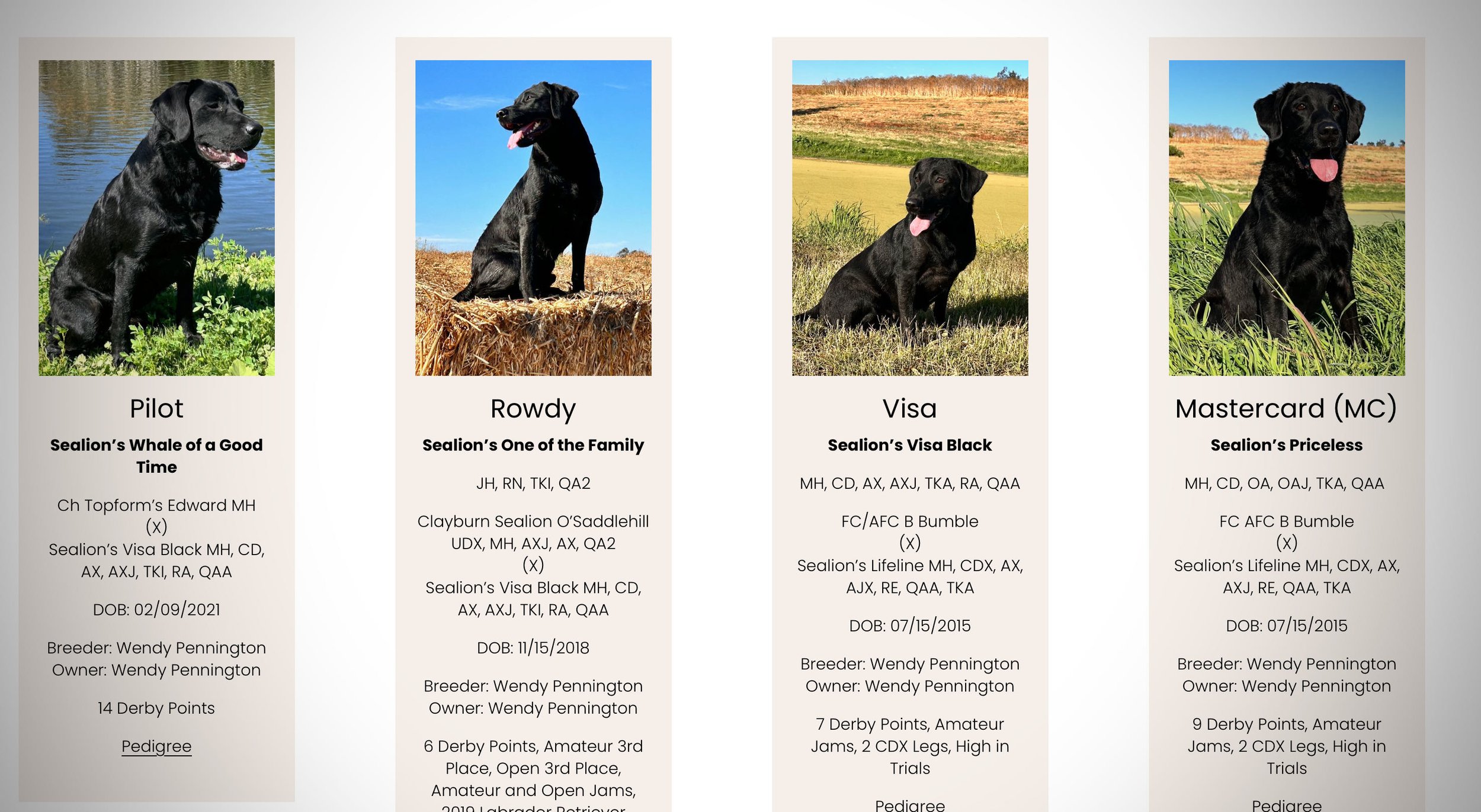
From her input, I created a history page of her dogs, categorized with lineage for easy viewing in order from A to Z. No fudging. The text had to be carefully edited to reflect the standards of the American Kennel Club and its members. Buyers of pure-bred Labradors are particular about the format of AKC Registration names, how AKC competition titles are associated with the dog, and what follows had to become a precise digital history that any smart puppy buyer would love to see.
It was by far the most time I’d spent creating a digital log about dogs. But not unusual in that high-profile dog people are extremely focused on the details.
Now that might not seem important to others, but in the dog world seeing a dog’s history is paramount. A complete history gives cues about the structure of the dog from generation to generation, and the lineage from where each dog was birthed. It’s Ancestry.com for dog owners.
This history is critical for prospective puppy owners and can be frequently referenced years down the road. Moreover, a library like this can be designed to click through to other third-party Websites like Pedigree.com, where people can access even more information.
What I managed to figure out is an effective Website about dogs doesn’t have to be high-tech it just has to be usable. People should find a pleasurable experience awaiting them, not something that strains the eyes, is confusing, or difficult to navigate. Also, details are important no matter how small.
Many of the other Websites I visited had both cosmetic and data issues. Fonts need to pop with loads of contrast to be readable. Black-colored fonts against a dark background don’t serve anyone. Black-colored fonts against a light background are more welcoming.
The sizing and spacing of the text are also critical since mobile phones are quickly becoming the choice for viewers online. The same goes for the color selection of the background pages, and how the navigation or menu is constructed.
Color selection of background pages should reflect the brand. For my client I selected a shade of gray/blue as the background because of her kennel name, I recommended an ocean feel and included these waves to separate the sections of content. It was a way to brand the business with a particular look, and She seemed satisfied with the results. Again, these are minor graphic influences at play, not rocket science. Platforms like Squarespace and Wix make color selection easy.
Going back to simplicity, the Website needed a gallery section of photographs that told a story about Wendy and her dogs. These images were carefully edited to provide a well-rounded view of what she does, whether it is AKC Field Trials, Conformation, Agility, or Obedience. I intentionally didn’t use video, but that could be a benefit to viewers in the future. Video is one way of keeping your Website traffic on your site as long as possible. It’s key to converting a Website visit into a sale of a product, or service.
Dog breeders should steer away from using social media as a “landing platform.” Nothing takes the place of a well-structured Website. Sending someone to a Facebook Page is like listing your dog business in the classified section of a newspaper. It does the job but is sorely lacking in a professional look that only a Website offers.
I hope this helps clear the air about dog breeder Websites, and how a little bit of research before site construction begins goes a long way in producing functional Websites, with the end user in mind. For a closer look go to https://www.sealionlabs.net.


